Here you'll find a variety of articles and tutorials on topics such as web development, software engineering, and programming languages.
Lottery Number Generator (Lotto Max and 6/49)
I’m thrilled to share a project I’ve been working on: a Lottery Number Generator web app! You can check it out live at https://barkatkamran2015.github.io/lottery/. This was a fun dive into front-end development, and I’m excited to walk you through what it’s all about.
What Does It Do?
The app is simple yet engaging: click the “Generate” button, and it spits out six random numbers, each displayed in a colorful circle. Feeling like a fresh start? Hit the “Reset” button to clear the slate. It’s designed to mimic the excitement of picking lottery numbers, with a clean and responsive interface that works across devices.
Tech Stack and Features
HTML/CSS/JavaScript: The core trio powering the app. The UI is built with HTML, styled with CSS for a modern look (gradient background, anyone?), and brought to life with JavaScript for the random number logic and animations.
Responsive Design: Looks great on desktops, tablets, or phones.
Interactive Animations: Numbers pop in with a smooth effect, adding a touch of flair.
GitHub Pages Hosting: Deployed effortlessly for the world to see.
Why I Built It
I wanted to create something fun and practical while sharpening my front-end skills. This project let me experiment with JavaScript’s random number generation, DOM manipulation, and CSS animations. Plus, who doesn’t love the thrill of a lottery-style app? It’s a small but satisfying project that I hope brings a smile to anyone who tries it.
Likes: 1
Project Launch: Prime Auto Exchange
I'm excited to share my latest project: Prime Auto Exchange — a full-stack automotive dealership platform built with Next.js and MongoDB.
🖥️ Modern UI: Clean, responsive design for an intuitive user experience.
🔍 Dynamic Inventory: Seamless browsing of new and used vehicles.
🔐 User Authentication: Secure login system for personalized access.
📦 MongoDB Integration: Efficient data management for vehicle listings and user information.
This project allowed me to deepen my expertise in full-stack development, focusing on building scalable and maintainable applications. I'm proud of the result and eager to take on new challenges.
If you're interested in discussing this project or potential collaborations, feel free to reach out!
UI Showdown: Pineapple 🍍 vs. Orange 🍊 – Which Design Wins?
We’ve crafted two stunning UI card designs to compare and contrast – one featuring a pineapple and the other an orange. Beyond their visual appeal, we’ll dive into the differences in design and code to determine which stands out. Check out the designs below and let’s break it down!
Design Differences
Pineapple Card (Left): This design boasts a minimalistic layout with a vibrant pineapple image, an icon-based "Add to Cart" button, and a centered price. The icon approach offers a compact, intuitive interaction, appealing to users who prefer quick visual cues.
Orange Card (Right): Featuring a fresh orange image, this card opts for a text-based "Add to Cart" button with the price aligned to the right. This layout provides a cleaner, more traditional e-commerce feel, enhancing readability for price-conscious shoppers.
Which is Better?
Design: The Orange card edges out with its readability and e-commerce-friendly layout, making it ideal for broader user adoption.
Code: The Pineapple card’s code is lighter and easier to maintain due to the icon-based button, while the Orange card’s flex layout offers more styling versatility.
Verdict: The Orange design wins for user experience, but the Pineapple code is preferable for simplicity. Depending on your project needs—usability or maintainability—choose accordingly! What do you think? Share your thoughts in the comments!
Likes: 0
Crafting a Dynamic Bottom Navbar with Particle Effects in SwiftUI
In today’s post, I’ll guide you through the process of creating a visually stunning and interactive bottom navbar in SwiftUI. This navbar isn't just functional but also features smooth animations, haptic feedback, a dynamic wave effect, and a particle system that adds an extra layer of interactivity to your app. The combination of these elements creates a beautiful user experience that keeps users engaged.
Key Features:
Animated Gradient Background: The background color of the navbar dynamically changes based on the selected tab. This change is animated, creating an immersive experience for users.
Wave Effect: When a tab is selected, a circular wave effect expands outward, signaling a transition to the new tab with a subtle visual cue.
Particle System: A particle system generates colorful particles that burst out when the tab changes, giving the app a lively, responsive feel.
Haptic Feedback: With every tab selection, haptic feedback is provided to enhance the user’s tactile experience.
Smooth Transitions: Each tab content smoothly transitions with a spring animation, providing a fluid and responsive navigation experience.
Get the source code from here: https://github.com/barkatkamran2015/BottomNavbar
Likes: 2
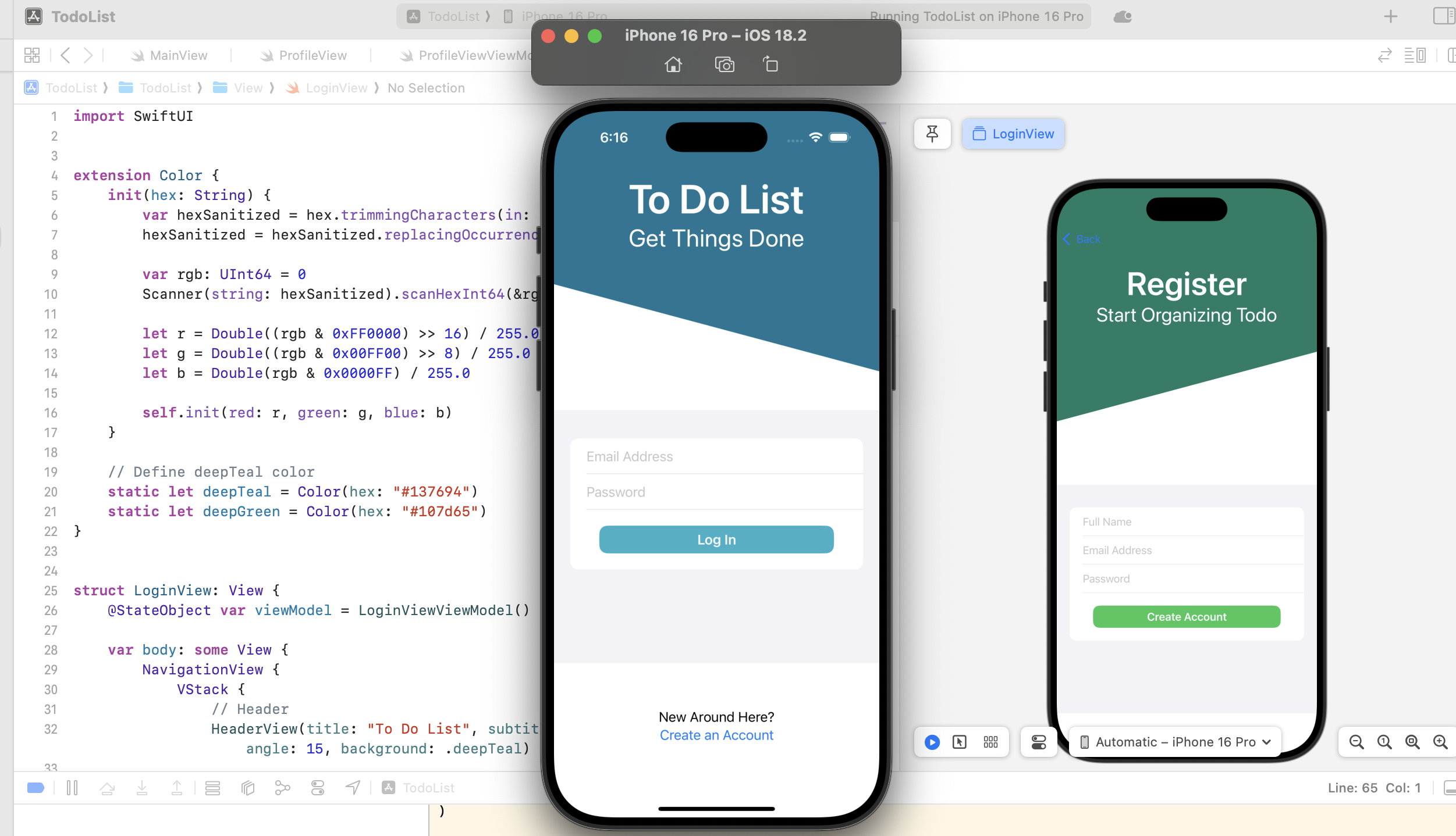
Building a To-Do List App with SwiftUI
Introduction
Managing tasks efficiently is crucial in our daily lives, and what better way to do it than by building a To-Do List app? In this project, I developed a To-Do List app using SwiftUI, implementing features like user authentication, a modern UI, and seamless navigation. This post will walk you through the key aspects of the app and my development experience.
Features
This SwiftUI-powered To-Do List app includes:
✅ User Authentication – Secure login and registration functionality. ✅ Modern UI Design – A custom-designed HeaderView with a stylish background and typography. ✅ Task Management – Users can add, edit, and delete tasks (coming in future updates). ✅ Form-based Input – Users enter their email and password with a smooth interface. ✅ Custom Components – A reusable button (TDButton) for consistent styling. ✅ Navigation – Easy transition to the registration screen for new users. ✅ Error Handling – Displays error messages when login fails.
Development Journey
1. Building the UI
I started with a custom header view that dynamically adjusts its background color and typography. The layout includes a form-based input system to capture the user's email and password.
2. Fixing the Keyboard Issue
Initially, when typing in the email or password fields, the keyboard covered the inputs, making it difficult to see what was being typed. To fix this, I used a ScrollView and keyboard detection to adjust the UI dynamically when the keyboard appears.
3. Handling Authentication
For authentication, I implemented a basic login and registration system. While it currently doesn’t use a backend, Firebase or a custom API could be integrated in the future.
4. Installing on iPhone
One challenge I faced was that when I installed the app on my iPhone, it required Developer Mode to be enabled. After installation, if Developer Mode was turned off, the app wouldn’t open. To solve this in the future, I plan to distribute the app via TestFlight or the App Store.
Lessons Learned
SwiftUI makes UI development faster and more intuitive. Handling the keyboard properly is crucial for a smooth user experience. Distributing an app on iPhone requires planning beyond just development.
Likes: 1
Building an iPhone Calculator App with SwiftUI
Introduction In this post, I’m going to walk you through building a simple yet functional iPhone Calculator app using SwiftUI. This app includes the basic functionalities you’d expect from a calculator, such as addition, subtraction, multiplication, division, and more. It also handles edge cases like dividing by zero and displaying an error message.
Key Features:
Basic Calculator Functions: Supports addition, subtraction, multiplication, and division.
Decimal & Percent Calculations: Allows decimal entry and percentage calculations.
Clear and Reset: Includes options to clear the display and reset the calculator to its initial state.
Error Handling: Properly handles division by zero and invalid inputs, displaying an error message when necessary.
User Interface: Built using SwiftUI's Grid and Button components for a clean, modern look.
Conclusion:
This iPhone Calculator app built with SwiftUI is a simple yet powerful project that helped me deepen my understanding of SwiftUI's Grid layout and state management. It also gave me the opportunity to practice handling user input, performing arithmetic calculations, and managing errors.
Likes: 1
Building a Cross-Platform Todo List App for iOS and Android
Building a Cross-Platform Todo List App with React Native
In this post, I will share the process of building a Todo List app using React Native and Expo for both iOS and Android. The app allows users to add, edit, and delete goals (tasks) and displays them dynamically.
Key Features:
Cross-Platform Support: Built for both Android and iOS with React Native, using the same codebase.
Dynamic Goal List: Tasks are rendered using FlatList, allowing for smooth updates.
Modal Input: Users can add tasks using a modal, which can be shown or hidden.
Delete by Tapping: Users can delete a goal by simply tapping on it.
Cancel Button: Users can cancel the goal input in the modal.
Custom StatusBar: StatusBar styling is customized for both platforms.
Development Process:
I began by setting up a basic Expo project, ensuring the app worked seamlessly on both platforms. The biggest challenge I faced was ensuring consistency across different screen sizes and handling platform-specific styling. For example, customizing the StatusBar required handling platform differences between iOS and Android.
Likes: 1
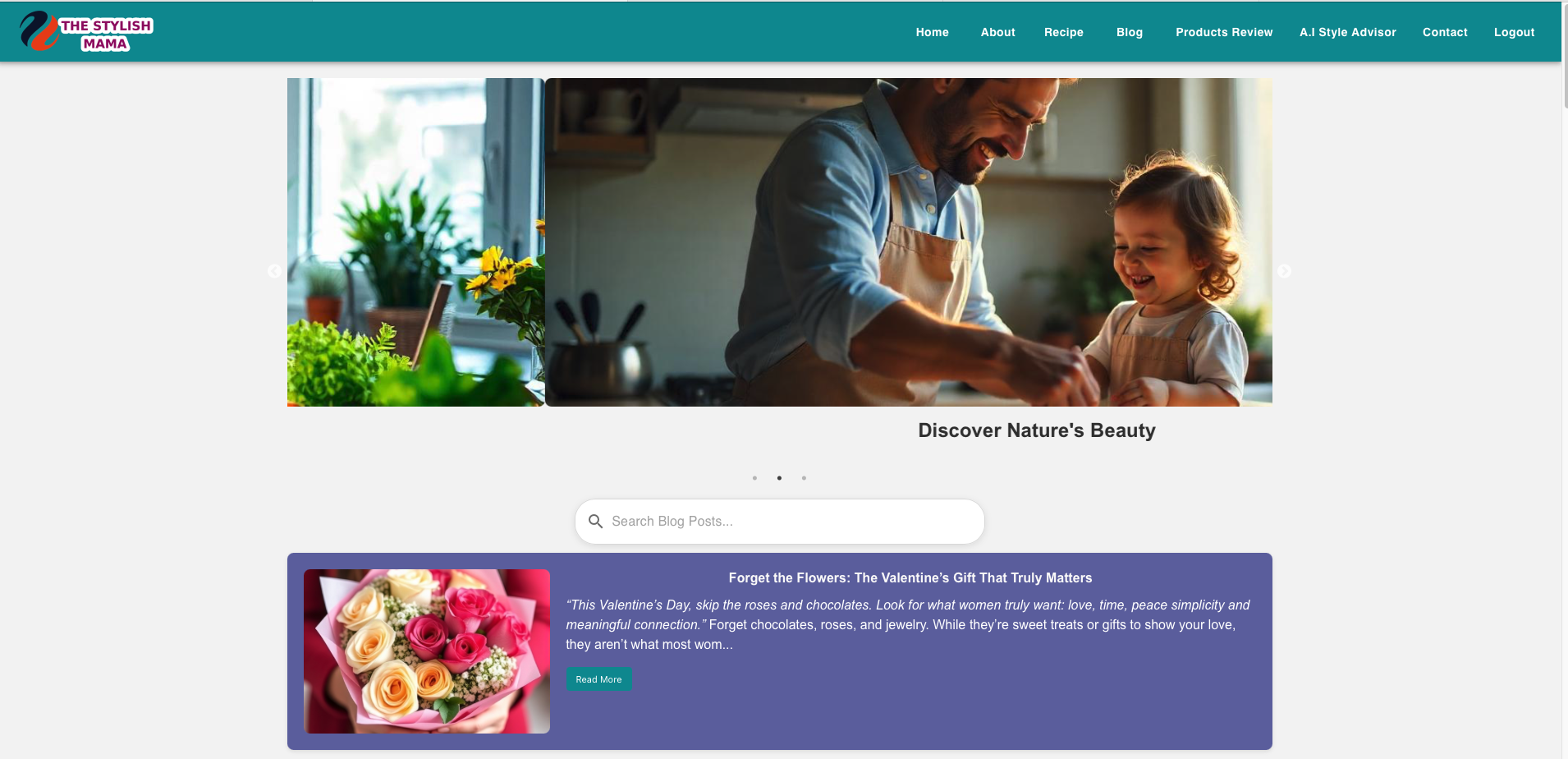
Building "The Stylish Mama" – A Journey of Growth and Learning
As a developer, every project brings its own set of challenges, opportunities, and lessons. One of my most rewarding experiences was designing and developing The Stylish Mama, a parenting website tailored to provide practical advice, inspiration, and community for modern moms.
This project allowed me to stretch my creative and technical skills, delivering a platform that’s both visually appealing and highly functional. Here’s a look at what I learned and the standout features of this dynamic parenting website.
What I Learned from Building "The Stylish Mama" 🌟
1. Balancing Creativity with Functionality
Creating a parenting website requires more than just aesthetics—it’s about crafting an engaging user experience. I learned how to design a layout that’s both stylish and user-friendly, ensuring visitors can navigate the site with ease while enjoying its modern design.
2. Enhancing Collaboration Skills
Working closely with the client to understand their vision for The Stylish Mama helped me refine my ability to turn ideas into tangible, interactive features. Their input shaped the site’s content structure, visual elements, and functionality.
3. Optimizing for Performance
Since parents often access websites on mobile devices, I focused on optimizing performance for speed and responsiveness. This required a deep dive into mobile-first design principles and testing across devices to ensure a seamless experience.
4. Integrating Advanced Features
Developing advanced interactive elements like the custom comment section and rich-text editor helped me deepen my understanding of backend systems and frontend frameworks.
Key Features of "The Stylish Mama" 🍼✨
1. Elegant, Responsive Design
The website features a sleek, modern design tailored to resonate with its target audience—moms looking for inspiration and support. Its fully responsive layout ensures optimal viewing across all devices.
2. Custom Comment Section
Engagement is key for any blog, and the interactive comment section allows users to share their thoughts, ask questions, and connect with others. Each comment is assigned a unique name for personalized interaction.
3. Rich Content Management
The platform supports dynamic content updates with a rich-text editor, enabling easy management of blog posts, recipes, and parenting tips.
4. Advanced Search and Filter
Users can effortlessly find articles and resources using advanced search and filter options, ensuring they quickly access the information they need.
5. SEO and Performance Optimization
The site is optimized for search engines to increase visibility while ensuring fast load times to enhance the user experience.
Why "The Stylish Mama" Stands Out
The Stylish Mama isn’t just another parenting blog—it’s a hub of inspiration, advice, and community for moms. By incorporating visually stunning elements with practical features, the website creates a warm and welcoming space for its audience.
Final Thoughts
Developing The Stylish Mama was an enriching experience that expanded my technical skills and allowed me to deliver a platform that meets real-world needs. I’m proud to have contributed to a project that supports and uplifts its audience.
If you’d like to explore The Stylish Mama, you can visit it here. This project is a testament to the power of combining creativity and technology to make a positive impact.
Have you ever felt overwhelmed by the sheer number of receipts you accumulate? Whether they’re for groceries, business expenses, or personal purchases, managing receipts can quickly become chaotic. That’s where Paperless Track, our innovative Android app, steps in to revolutionize the way you handle receipts.
What is Paperless Track?
Paperless Track is an Android application designed to help users upload, organize, and manage receipts effortlessly. Using cutting-edge technology, the app enables you to digitize your receipts and categorize them, making them easily searchable and accessible whenever needed.
Key Features:
Receipt Image Uploads: Snap a picture of your receipts or upload existing images for secure storage.
Data Extraction: Extract essential receipt details like vendor name, total amount, and date automatically.
Categorization: Organize receipts into categories like groceries, utilities, or travel for easy tracking.
Search Functionality: Find any receipt in seconds using the app’s smart search features.
Secure Storage: All data is stored securely, ensuring your financial records are protected.
Why Choose Paperless Track?
In a world moving toward sustainability, Paperless Track helps reduce paper waste by digitizing your receipts. It’s perfect for busy professionals, business owners, and anyone looking to simplify their expense tracking process.
Likes: 4
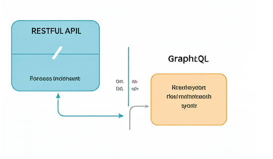
RESTful vs. GraphQL: A Deep Dive
In today's interconnected world, APIs (Application Programming Interfaces) play a crucial role in facilitating data exchange between applications. Two prominent architectural styles for building APIs are RESTful and GraphQL. While both serve the purpose of exposing data, they differ significantly in their approach and capabilities.
This blog post will delve into the core concepts of RESTful and GraphQL APIs, explore their strengths and weaknesses, and discuss the challenges involved in migrating from REST to GraphQL. By understanding these differences, you can make informed decisions about which API style is best suited for your specific project requirements.
Understanding RESTful APIs
RESTful APIs adhere to a set of architectural constraints, such as statelessness, client-server architecture, and caching. They use HTTP methods (GET, POST, PUT, DELETE) to represent CRUD (Create, Read, Update, Delete) operations on resources.
Key characteristics of RESTful APIs:
Resource-oriented: Each piece of data is treated as a resource with a unique identifier (URI).
Stateless: Each request is independent and doesn't rely on previous requests.
Caching: Responses can be cached for improved performance.
Layered architecture: Allows for scalability and flexibility.
GraphQL: A Modern Approach
GraphQL, introduced by Facebook in 2015, offers a more flexible and efficient approach to API design. It uses a query language to describe the exact data a client needs, reducing over-fetching and under-fetching.
Key features of GraphQL:
Strongly typed schema: Defines the structure of data and operations.
Declarative data fetching: Clients specify the exact data they need.
Subscriptions: Enable real-time updates.
Reduced network traffic: GraphQL can fetch multiple resources in a single request.
Migration Challenges
Migrating from REST to GraphQL involves several challenges:
Data modeling: Designing a GraphQL schema that accurately represents your existing data model can be complex.
Performance optimization: Ensuring GraphQL queries are efficient and avoid performance bottlenecks.
Developer adoption: Learning GraphQL query language and concepts can take time.
Backward compatibility: Handling both REST and GraphQL APIs during a phased migration.
Best Practices for a Smooth Migration
Plan carefully: Create a detailed migration plan, including timelines and resource allocation.
Start small: Begin with a subset of endpoints and gradually migrate more functionality.
Thorough testing: Rigorously test the GraphQL API to ensure it functions correctly.
Provide documentation and training: Help developers understand and adopt GraphQL.
Conclusion
Both RESTful and GraphQL APIs have their strengths and weaknesses. The choice between them depends on your specific project requirements, team expertise, and long-term goals. By understanding the core concepts and challenges involved in migration, you can make an informed decision and ensure a successful transition.
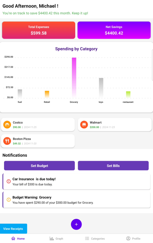
Introducing the Paperless Track App: Simplifying RM for Everyone!
In today’s fast-paced digital world, keeping track of receipts and expenses can be overwhelming, especially for families, students, and busy professionals. That’s why I’m excited to introduce Paperless Track, an intuitive receipt tracker app designed to make receipt management easier and more efficient.
What is Paperless Track?
Paperless Track is a web-based application that allows users to store, categorize, and manage receipts digitally. Whether you’re a household tracking monthly expenses, an international student managing finances, or someone who simply wants to go paperless, this app provides a user-friendly solution to help you stay organized.
Key Features of Paperless Track:
1. Receipt Upload & Storage: Users can easily upload their receipts by snapping a picture or manually entering receipt data. All receipts are securely stored and can be accessed anytime, anywhere.
2. Categorization: The app automatically categorizes receipts into essential categories like groceries, utilities, and entertainment, making it easier to monitor spending patterns.
3. Expense Summary: With Paperless Track, users can view their total expenses and gain insights into how they are spending their money. Subtotals, taxes, and total amounts are clearly displayed for each receipt.
4. Gmail Integration: We’ve also added the option to log in using a Gmail account for seamless access and enhanced security.
5. Forgot Password Functionality: Never worry about being locked out. Our user-friendly password reset functionality is now live and working perfectly.
Why Paperless Track?
With the growing shift towards digitization, managing paper receipts is not only inconvenient but also environmentally unfriendly. Paperless Track provides a sustainable and secure solution, helping users reduce paper clutter and gain control of their finances. Whether you’re a frequent shopper, a small business owner, or an international student, this app is tailored to meet your needs.
What’s Next?
We are continually improving the app and looking to add more features such as detailed financial reports, budget alerts, and expense sharing for families or teams. Stay tuned for more updates as we continue to enhance the user experience.
Likes: 9
Why Java is important?
What does Java do?
Java has become invaluable to developers by enabling them to:
Write software on one platform and run it on virtually any other platform.
Create programs that can run within a web browser and access available web services.
Develop server-side applications for online forums, stores, polls, HTML forms processing, and more.
Combine applications or services using the Java language to create highly customized applications or services.
Write powerful and efficient applications for mobile phones, remote processors, microcontrollers, wireless modules, sensors, gateways, consumer products, and practically any other electronic device.
Likes: 6
Mobile Application Design and Development
Overview
The Web and Mobile Application Development (WMA) Associate Certificate is built on top of Applied Software Development (ASD). Focus on advanced JavaScript tools in Back-end Node.js and Front-end React.js and build web apps with PHP. Electives include mobile, DevOps with Kubernetes, quality assurance (QA), and advanced web application development.